| |
ĀĀĀ | IEEE Visualization 2004 Contest Entry Interactive Visual Analysis of Hurricane Isabel with SimVis Helmut Doleisch, Philipp Muigg, and Helwig Hauser VRVis Research Center, Vienna, Austria |
ĀĀĀ | |
SimVis is an interactive visual analysis technology for multi-variate and time-dependent
3D simulation data on unstructured grids, which has been developed at the
VRVis Research Center in Vienna, Austria, in the past few years. The SimVis
approach to visual exploration and analysis of flow simulation data is based on
(a) interactive feature specification through interactive brushing in data views
of various kind (scatterplots, histograms, and others), (b) a smooth approach to
feature specification (similar to fuzzy classifications), (c) an intelligent way
of extending and combining brushes to access complex data inter-relations,
(d) focus-plus-context 3D visualization for spatial orientation, etc. .
In the course of the Visualization Contest 2004 (IEEE Visualization 2004),
SimVis has been used to interactively explore and analyze the simulated hurricane Isabel.
With only a few extensions such as new color maps, for example, and after
sub-sampling the data to allow interactive visualization on a regular PC, it was
possible to effectively investigate the high-dimensional and complex dataset.
With SimVis it is possible to instantly access all the data dimensions, including
3D space, time, and about a dozen of data attributes concurrently and in an integrated manner.
A 2-pages PDF-Document is available giving a brief discussion and overview about the interactive visual analysis and exploration session. More information is given below next to the images for each analysis step.
The software runs interactively on a standard PC containing the following components:
CPU: Intel P4 3.0 GHz (800MHz frontside bus)
Ram: 2GB DDR Memory (400MHz)
Harddisk: 2x 80Gb in a raid 0 setup
Graphics Card: GeforceFX 5950 (256Mb RAM)
In order to prepare the dataset for the SimVis system it had to be downsampled.
We decided to generate one relatively low resolution dataset (100x100x20)
containing 24 timesteps that was used
during the interactive analysis, which contained all the data channels that
were supplied and additionally the following derived attributes:
- horizontal flow angle
- vertical flow angle
- flow velocity
- horizontally normalized temperature
- horizontally normalized pressure
- spatial difference of the cloud channel
- spatial difference of the flow velocity
- spatial difference of the horizontally normalized temperature
- spatial difference of the horizontally normalized pressure
Furthermore we made several additional datasets containing the same attributes but only one single timestep at a resolution of 250x250x50 to produce the images that can be seen below. The rendering of those datasets was still interactive at a framerate of approximately 15 frames per second.
The video capturing software (Camtasia Studio) that was used to grab the screen during the visualizations ran in the background on the same PC and was not able to grab all frames that were displayed in the 3D-rendering view. Thus the framerate during interactions shown in the video is far less than the actual performance of the system. On average around 45 frames per second can be achieved in the subsampled dataset that was used for the interactive demonstration. The update after a data selection change is roughly 0.5 seconds.
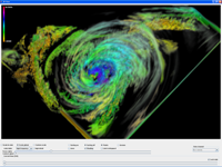
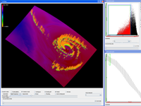
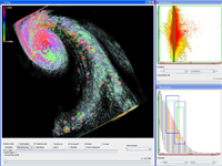
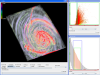
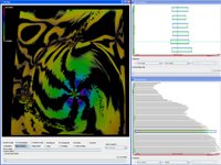
The SimVis System supports multiple ways to explore a given dataset. Firstly it
provides a basic overview over the spatial distribution of the data cells in the
3D rendering view. Here a transfer function can be applied to one selectable data
channel. The opacity that is assigned to every rendered data cell is specified by the
degree of interest that the user has specified for it. This specification of a region
that should be in focus is one of the most central parts of SimVis since interacting
with the system mostly means refining extending or modifying those regions. This can
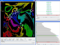
be done in multiple linked views like Histograms and Scatterplots by brushing data items
that should be emphasized in the 3D view. Besides standard brushing (resulting in a binary classification
of the data) also smoothly brushing data values is enabled, to account for the
normally smooth distribution of data values in flow datasets.
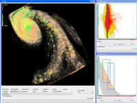
Another approach that can be taken with SimVis to explore and analyze especially
high dimensional datasets is to use the different InfoVis views, e.g. scatterplots, to
view the distribution of the already selected data items in different attribute spaces.
This can help to find correlations and other dependencies that might provide
interesting and important information.
After the specification of those two features the exploration through the time dimension can easily be accomplished by stepping through the single timesteps in the 3D view.
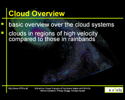
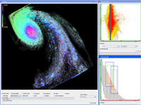
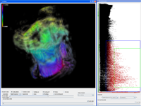
Now that a basic understanding of the cloud structures has been gained, further analysis can be carried out by focusing on the question if clouds can be found in regions of high flow velocity. This can be achieved by simply selecting portions of the data set that contain high velocity and clouds. Furthermore the velocity is mapped to color in the 3D view. Again by stepping through the time dimension, further insight into the data can be gained. It can be shown, that the clouds surrounding the center of the hurricane are within regions of extremely high velocities. What can be witnessed as well is a cloud gap in this thick wall of clouds about 34 hours after the start of the simulation, that will be discussed later on in more detail.
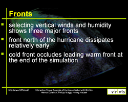
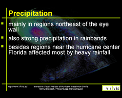
After examining those clouds near the center an overview over other cloud portions in calmer regions of the dataset can be made by now selecting clouds in cells exhibiting low flow velocity. This selection now clearly shows the rainbands that form around the hurricane at three different fronts which will be discussed in another video more closely. Those clouds can be classified as Cumolonimbus, which exhibit the typical towering structure with a slight overcast.
Then the cells exhibiting updraft are selected. In order to concentrate on the lower regions of the atmosphere which seems to play a big part in the process of cloud creation the selection is limited to those portions of the dataset. Again the rainbands can be recognized easily. Furthermore the asymmetry of the updraft regions around the eye are quite interesting. It seems that the gap that was visible in the high velocity clouds selection from the previous video is visible here as well. Cloud creation is normally hinderd by downdrafts and for now we assume, that in this region near the center of the hurricane such downward winds reduce cloud generation or even dissipate them. In a later video about up- and downdrafts we will discuss this in more detail.
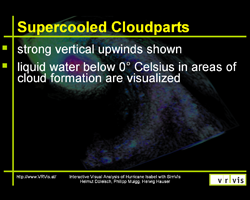
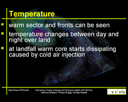
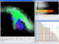
Besides the aformentioned phenomenom we were interested in some other commonly known cloud properties like the existence of supercooled water which should exist in relatively large quantities in clouds of the proportions witnessed in this dataset. To test this we simply set the scatterplot to show the temperature and the "qcloud" channel, which describes cloud portions made up of liquid water. Here we can again test our previous selection against those two new data attributes by examining the distribution of seleced (red) portions in the scatterplot. We see, that we already selected some supercooled water, but that the biggest portion of our selection was above the freezing point, which is marked by the thin green line. The cause for this is, that we previously limited our selection to relatively low atmospheric regions. Our new selection will now encompass only the portions of the dataset containing liquid cloud water in regions below freezing point. This new selection shows that our assumptions were true and that we can find large batches of cells that satisfy this criteria at the rainbands and near the hurricane center a few kilometers above ground. In this height the asymmetry of the center is again very easily visible.
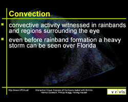
By examining the time dimension the very early generation of a storm cell over Florida can be witnessed, which takes place even before the main rainbands evolve. Furthermore, this visualization shows very strong convective bands spiraling out from the center of the hurricane (and to a lesser degree from the storm over florida). During our investigation we did not find any phenomenom matching those bands. Still we wanted to mention it, since those bands are so easily recognizable.
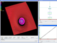
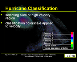
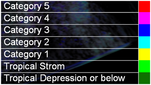
In order to gather more insight into the convective activity of the hurricane near its center we again refined our selection by brushing only cells within a certain spatial location which resulted in the selection of a slice of the dataset. By moving the brush in the lower right scatterplot the position of this slice can be changed interactively. Additionally regions of high velocity are selected and thus only areas outside the eye can be examined. In this visualization the cause for the gap in the clouds that was mentioned in the description of the first video can be seen quite clearly. Air is flowing downward in a very narrow channel and thus hinders cloud formation at this part of the hurricane. Besides this, multiple small convective cells can be seen in the selected slice right next to the eye wall.
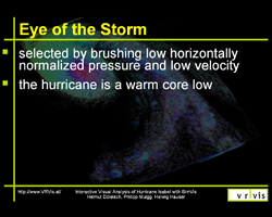
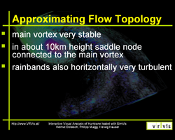
With this setup the flow within the dataset can be observed and overviewed conveniently. Vortices and saddle points can be located by looking for points where all six selected bands meet. In order to distinguish vortices from saddles, the order of the colors has to be considered. If a vortex lies around the point of interest, the different bands, which have to be viewed in a clockwise order, must be colored like the color scale downwards. To detect whether it is a cyclonic or anticyclonic vortex the location of the bands has to be checked. A cyclonic vortex, like the hurricane itself, always has its green band at the east while anticyclonic vortices have theirs on the west side. Every point of interest that is no vortex is a saddle.
With this knowledge we examined the dataset and realized that there are some vortices and saddle nodes besides the hurricane itself. Those are rather weak and mostly confined to thin layers of the atmosphere. The only exception to this is a saddle node and an anticyclonic vortex that can be witnessed at about 13 km height. The saddle and the anticyclone seem directly connected to the main vortex of the hurricane and are also moving together as time progresses.
| Related Projects at VRVis | Key-References related to this Project |
|
|